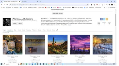
From what I can tell at a glance its eye catching. Though some folders only have like 1 or 3 things, it should have more or be mixed together with something else.
Did you have the system write the description?

A rustic blacksmith shop, with a weathered metal exterior, stands behind an array of antique machinery and equipment. A prominent large metal wheel in the foreground suggests the presence of historical industrial activity. Found on the hillside of Jerome, Arizona this old copper mining town is full of historical metal works. A photographers haven for industrial type photographs and prime for HDR photography,
especially that last line is weird.

some of the images seem over baked to me, like the contrast and saturation were too high, it makes it hard to focus on the main subject which is the chairs.

some images have close ups and others don't, this is a bit crooked by the way.

the whole series could use better titles. Don't just use the keywords the ai makes, add your own - like door. Its listed as pink door and people may not type it like that. But try to make the titles more exciting sounding then door xxx even mentioning the location might be better.

this is really noisy and probably won't print. It looks like an HDR but its overcooked, every image needs highlight and shadow, and this is very flat, my guess is many of the images here are tonemapped, flattening it out.

real hdr has 3 or more images stacked, its not just run through a tone mapper, you can see how the window is both blown out and black at the same time. And how the boots blend into the scene. You would have been better off with the original and kept shadow and highlights which make the image look more dramatic.
I'm not crazy about the AI descriptions, I would use that as a starting point and make it sound more natural, take us there, rather than list the contents.
Personally I like bio's read in the first person, as Mike is mentioned over and over and while a very fine and excellent name, I think the personal touch is better.
----Mike Savad